Best data visualization recommendations by category
- Best for Enterprise: Tableau, because it handles millions of data rows effortlessly, offers 100+ data connectors, and provides comprehensive analytics capabilities trusted by large organizations.
- Best for Small Teams: Power BI, with affordable pricing at $14/user/month, a user-friendly interface, and seamless integration with Microsoft tools like Excel and Teams, making it accessible for growing teams without breaking the budget.
- Best for Non-Technical Users: Visme, with its intuitive drag-and-drop interface that requires no coding or design skills and includes an extensive template library for quick visualization creation.
- Best for Technical Users: D3.js, offering complete customization control, enabling unique custom visualizations, and providing unmatched flexibility for developers comfortable with JavaScript.
- Best Free Option: Looker Studio, because it’s a full-featured platform at no cost that provides real-time data updates and includes strong collaboration features without requiring payment.
- Best All-Around Value: Tableau is the best data visualization tool, with exceptional visualization capabilities and 100+ data connectors that scale from small teams to large organizations. While the initial price is higher than others, many users find that other platforms require upgrades to Pro or Premium to access desired features, making Tableau’s comprehensive feature set at each pricing tier a better long-term value.
Data visualization tools have transformed how I make sense of complex information, and I’m not alone in this revelation. The ability to present complex information in a clear and concise manner is crucial for making informed decisions, and that’s why now it’s more important than ever to find the best data visualization tool that fit our needs.
Raw data alone actually doesn’t help people make decisions. It’s the way we present those numbers that creates meaning. According to the latest survey by IMARC, the global data visualization market is expected to reach USD 8.2 billion by 2033, exhibiting a growth rate of 7.38%. This explosive growth isn’t surprising when you consider that up to 81% of companies think that data should be at the heart of their business decision-making strategy.
I’ve spent countless hours testing different data visualization software over the years, and I can tell you firsthand that choosing the right tool makes all the difference. Whether you’re a data analyst, business leader, or marketing professional, having the right data visualization software can transform confusing spreadsheets into compelling visual stories that drive action.
In this comprehensive guide, I’ll walk you through the 15 best data visualization tools to consider in 2026, comparing their features, pricing, and ideal use cases to help you find your perfect match.
1. Tableau
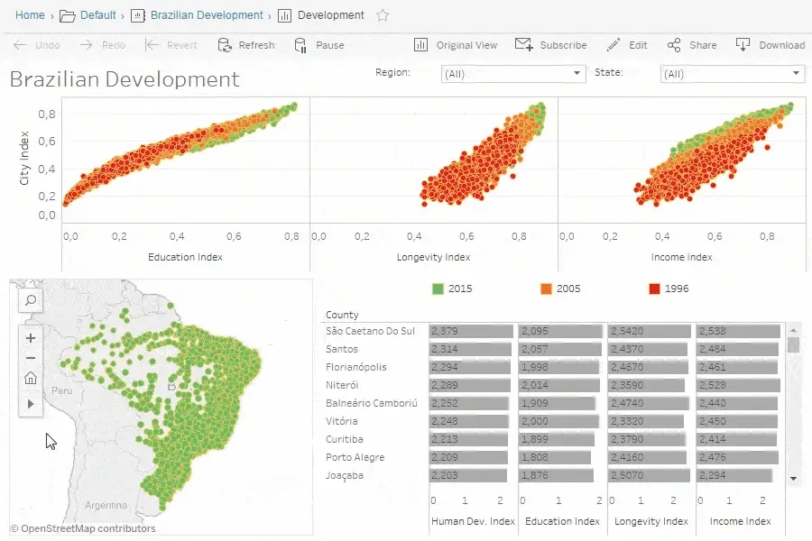
Image Source: Tableau
Tableau stands as one of the pioneers in the data visualization space, founded in 2003 with the primary aim of making data analysis comprehensive and interactive.
Tableau key features
Tableau excels with its VizQL technology that translates drag-and-drop actions into optimized queries without requiring SQL knowledge. Moreover, it handles millions of data rows effortlessly while maintaining dashboard performance. The 2025 release introduces several innovative features including dynamic spatial parameters, dynamic color ranges, and custom themes that ensure consistent formatting across workbooks. Additionally, Tableau offers multilingual support in conversational French, Italian, German, Spanish, Japanese and Portuguese. The platform provides three main products: Tableau Cloud (fully hosted), Tableau Server (on-premises), and Tableau Next (for agentic analytics).
Tableau pros and cons
Pros:
- Exceptional data visualization capabilities that transform complex data into intuitive graphics
- Strong integration with over 100 data connectors
- Robust performance with large datasets
- Active online community providing support and knowledge sharing
- Mobile accessibility through dedicated applications
Cons:
- Higher price point compared to competitors like Power BI
- No automatic refreshing of reports with scheduling functionality
- Layout can get distorted when viewed on different screen resolutions
- Potentially overwhelming number of features for new users
- Requires SQL skills for advanced database connections
Tableau pricing
Tableau offers three primary license types with varying costs:
- Standard Edition: Viewer (USD 15.00), Explorer (USD 42.00), and Creator (USD 75.00) per user/month, billed annually
- Enterprise Edition: Viewer (USD 35.00), Explorer (USD 70.00), and Creator (USD 115.00) per user/month, billed annually
- Tableau+ Bundle: Exclusive to Tableau Cloud with additional agentic analytics capabilities (custom pricing)
2. Power BI

Image Source: Microsoft
Microsoft’s Power BI ranks among the most versatile data visualization tools in the analytics landscape. As part of the Microsoft ecosystem, it transforms complex data into interactive insights without requiring extensive technical knowledge.
Power BI key features
Power BI excels with its comprehensive ecosystem that includes Desktop (for creation), Service (for sharing), and Mobile apps. The platform connects to over 500 data sources and offers direct integration with Microsoft 365 applications. In the 2025 release, Power BI has transitioned from Bing Maps to Azure Maps for enhanced mapping capabilities. The Copilot AI assistant generates DAX queries, creates reports instantly, and provides automated data summaries. Power BI’s OneLake integration establishes a unified data hub that helps maintain a single source of truth across organizations.
Power BI pros and cons
Pros:
- Seamless integration with Microsoft products like Excel, Azure, and Teams
- User-friendly interface with drag-and-drop functionality
- Extensive data connectivity options for both cloud and on-premises sources
- Real-time data access for timely decision making
- Relatively affordable compared to competitors
Cons:
- Performance issues when handling very large datasets
- Primarily Windows-focused, creating challenges for Mac users
- Steep learning curve for advanced features and DAX language
- Limited visualization customization compared to some alternatives
- Premium features locked behind higher-tier subscriptions
Power BI pricing
Power BI offers tiered pricing to accommodate different needs:
- Power BI Desktop: Free download with basic features
- Power BI Pro: USD 14.00 per user/month (paid yearly)
- Power BI Premium Per User: USD 24.00 per user/month (paid yearly)
- Microsoft Fabric (includes Power BI): Variable pricing based on capacity
3. Looker Studio
Image Source: Search Engine Journal
Google’s Looker Studio has evolved into an essential player in the data visualization tools market, offering a self-service business intelligence platform that transforms raw data into interactive dashboards without coding.
Looker Studio key features
Looker Studio connects to over 800 data sources, making it exceptionally versatile for data integration. The platform features an intuitive drag-and-drop interface that simplifies dashboard creation. Real-time data updating ensures all visualizations reflect the most current information. Additionally, the platform excels in collaboration, allowing multiple users to work simultaneously on reports. Notably, Looker Studio seamlessly integrates with Google’s ecosystem, including Analytics, Ads, and BigQuery.
Looker Studio pros and cons
Pros:
- Free basic version suitable for small teams and individuals
- Extensive customization options for reports and dashboards
- Intuitive templates that speed up report creation
- Strong data governance features ensuring compliance with GDPR and CCPA
- Convenient report sharing and embedding capabilities
Cons:
- Limited customization compared to advanced visualization tools
- Performance issues when handling large datasets
- Slow loading times for complex reports
- Connectivity challenges with some data sources
- Third-party connectors often require additional payment
Looker Studio pricing
The basic Looker Studio version is available at no charge for creators and report viewers. For enterprise customers, Looker Studio Pro costs USD 9.00 per user per project per month. Consequently, the Pro version includes team workspaces, Google Cloud project linking, expanded administrative features, and access to Google Cloud Customer Care support. Nonetheless, many users note that third-party connectors for non-Google data sources incur additional costs.
4. Yellowfin BI
Image Source: Yellowfin
Yellowfin BI, an Australian-born data visualization tool, stands out as a comprehensive analytics platform trusted by global companies.
Yellowfin BI key features
Yellowfin offers over 50 chart types that bring data to life with interactive visuals. The platform enables pixel-perfect dashboards with full control over component layouts. Beyond standard analytics, Yellowfin features unique capabilities like Signals, which automatically monitors data and alerts users to important changes. The platform’s Natural Language Query allows users to ask questions in plain English without requiring technical expertise. Essentially, Yellowfin supports both enterprise analytics and embedded analytics use cases, connecting to various data sources including JDBC-compliant databases, XML/A compliant cubes, and third-party applications.
Yellowfin BI pros and cons
Pros:
- Low-code to no-code dashboard building options
- Automated insights through AI-powered data analysis
- Robust collaboration features allowing simultaneous work
- Strong data governance and security capabilities
- Flexible deployment options (cloud, on-premises, or hybrid)
Cons:
- Advanced users may find charting flexibility restrictive
- Learning curve for new users unfamiliar with BI tools
- Performance could be faster according to some users
- Not compatible with Windows and BlackBerry phones
- Third-party connectors may require additional payment
Yellowfin BI pricing
Yellowfin offers flexible pricing models designed for accessibility and predictability. Their pricing structure includes:
- Named User: Based on number of users accessing the platform
- Server: Based on required CPU cores for larger deployments
- User Tier: Based on user types (writers or consumers)
- OEM/ISV options: Aligned utility models, revenue share models, and server core pricing
5. D3.js
Image Source: Medium
Unlike the plug-and-play tools discussed earlier, D3.js brings a different approach to data visualization as a powerful JavaScript library that empowers developers to create custom, interactive visualizations from scratch.
D3.js key features
D3.js (Data-Driven Documents) binds data directly to the DOM, allowing unprecedented control over visual elements through HTML, SVG, and CSS. This low-level framework excels at creating custom visualizations rather than offering pre-built charts. D3 leverages web standards completely, enabling external stylesheet usage and browser debugging tools integration. The library shines with its unique data join concept, allowing separate operations for entering, updating, and exiting elements with smooth transitions. Initially developed as a successor to Protovis, D3.js focuses primarily on web standards and improved performance.
D3.js pros and cons
Pros:
- Unmatched flexibility and customization options for creating unique visualizations
- Efficient handling of large datasets through optimized data binding
- Open-source nature with vibrant community support
- Seamless integration with web technologies (HTML, CSS, SVG)
- Transferable skills (learning JavaScript and HTML5 alongside D3)
Cons:
- Notoriously steep learning curve requiring JavaScript knowledge
- Performance limitations with extremely large datasets
- No default visual templates or chart types
- Requires more code than high-level visualization libraries
- Not ideal for quick prototyping or simple charts
D3.js pricing
D3.js stands apart from commercial alternatives as a completely free and open-source library. Unlike tools with subscription models, there are no setup fees or licensing costs associated with D3.js. The community has created numerous free extension resources and third-party wrapper libraries to enhance functionality.
6. Plotly
Image Source: Plotly
Plotly stands at the intersection of programming and interactive data visualization tools, offering remarkable flexibility across multiple programming languages. As a JavaScript-based library built on WebGL and D3.js, it enables developers to create highly customizable visualizations for the web.
Plotly key features
Plotly excels with its extensive interactivity features, allowing users to zoom, pan, and display tooltips for deeper data exploration. The library supports an impressive range of visualizations including 3D surface plots, choropleth maps, and bubble charts. Notably, Plotly works across Python, R, JavaScript, and MATLAB, offering exceptional flexibility for developers. Beyond visualization, it integrates seamlessly with web applications and dashboards for real-time data updates. Users appreciate the extensive customization options for colors, labels, axes, and legends.
Plotly pros and cons
Pros:
- High interactivity through zooming, panning, and hover effects
- Versatile chart options across multiple data types
- Web-friendly architecture compatible with Angular, React, and Vue
- Strong community support and extensive documentation
- Customization capabilities for detailed styling
Cons:
- Sizeable file weight affecting performance on mobile devices
- Struggles with very large datasets compared to static libraries
- Overly complex for creating simple visualizations
- Paid licensing required for certain advanced features
- Steeper learning curve than basic visualization tools
Plotly Pricing
Plotly offers tiered pricing with a free trial for beginners. The Pro plan costs USD 29.00 monthly (or USD 290.00 yearly, saving 17%), offering increased usage limits and private apps. The Max plan at USD 199.00 monthly provides five concurrent apps and SOC2 Type II compliance. For organizations requiring advanced security and governance, Enterprise plans with custom pricing include unlimited apps, team management, and private infrastructure.
7. Apache Superset
Image Source: Apache
Originally developed at Airbnb, Apache Superset has flourished into a powerful open-source data visualization platform that combines interactive exploration with enterprise-ready features. This lightweight yet scalable tool leverages existing data infrastructure without requiring additional ingestion layers.
Apache Superset key features
Apache Superset delivers a modern visualization experience with 40+ pre-installed chart types ranging from simple line charts to complex geospatial visualizations. Users enjoy both no-code exploration through an intuitive drag-and-drop interface and advanced SQL capabilities via a built-in SQL Lab IDE. The platform includes a semantic layer for SQL data transformations, plus virtual datasets for ad-hoc exploration. Performance remains smooth even with large datasets thanks to an intelligent data caching layer. Above all, Superset connects to virtually any SQL-speaking database or data engine, including PostgreSQL, MySQL, and Google BigQuery.
Apache Superset pros and cons
Pros:
- Open-source flexibility with no licensing costs
- Extensive visualization library with 40+ pre-installed options
- Comprehensive security through role-based access control
- SQL Lab functionality for direct query writing and execution
- Strong community support for continuous improvements
Cons:
- Steeper learning curve compared to commercial alternatives
- Limited native connectors requiring third-party solutions
- Permissions and access management can be challenging
- Lacks advanced analytics for predictive modeling
- No built-in option for joining multiple tables efficiently
Apache Superset pricing
As an open-source tool, Apache Superset is completely free to use. Organizations can self-host without incurring any licensing fees. For those preferring managed solutions, hosted versions are available starting around $25-35 per user monthly. Additionally, cloud deployment options exist through providers like Elestio, with costs varying based on the chosen cloud infrastructure.
8. Sisense
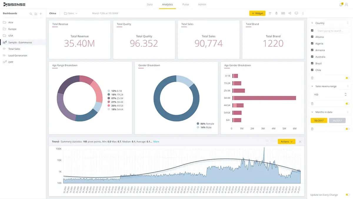
Image Source: Sisense
Sisense delivers an AI-powered analytics platform that transforms complex data modeling, visualization, and integration into intuitive processes for businesses across industries.
Sisense key features
Sisense’s ElastiCube engine provides high-performance, columnar in-memory data processing with In-Chip technology for fast query responses. The platform includes Sisense Intelligence, featuring AI-powered capabilities like Assistant for natural language queries, Narrative for automated chart explanations, and Forecast for trend analysis. Certainly, the centralized connection manager streamlines data access while dashboard co-authoring with Git integration enables real-time collaboration. Beyond standard visualizations, Sisense offers extensive JavaScript customization options through their Compose SDK.
Sisense pros and cons
Pros:
- Drag-and-drop interface accessible to non-technical users
- Exceptional scalability handling large, complex datasets
- Robust embedded analytics with white-label options
- Strong security through role-based access control
- Seamless API integration capabilities
Cons:
- Steep learning curve requiring technical expertise
- Elasticube setup can be challenging for average users
- Limited native support for unstructured data
- Premium pricing structure
- Documentation lacking sufficient detail
Sisense pricing
Sisense operates on a custom, quote-based pricing model. Self-hosted solutions start around $10,000 annually for five users, whereas cloud deployments begin near $21,000 per year. Generally, pricing varies based on user roles (viewers vs. designers), data volume, and computational requirements.
9. AgencyAnalytics
Image Source: Agency Analytics
AgencyAnalytics fundamentally differs from other data visualization tools by being purpose-built for marketing agencies, helping teams create interactive dashboards and client-ready reports with minimal effort.
AgencyAnalytics key features
This platform stands out with its integration capabilities, connecting to over 80 marketing platforms including Google Analytics, social media, and PPC tools. The drag-and-drop report builder enables quick customization without coding knowledge. Specifically, AgencyAnalytics offers white-label options, allowing agencies to add their branding, custom domains, and personalized color schemes. The platform’s Smart Reports feature automatically generates populated dashboards in just 11 seconds.
AgencyAnalytics pros and cons
Pros:
- Purpose-built for marketing agency reporting workflows
- Extensive integration options with 80+ platforms
- Complete white labeling capabilities for professional presentation
- Time-saving automated report scheduling
- Client access portal for transparent data sharing
Cons:
- Some users report the cover page of reports lacks customization
- Third-party connectors may require additional payment
- Limited to marketing analytics (not general data analysis)
- Can be expensive for smaller agencies
- Dashboard customization restrictions on lower tiers
AgencyAnalytics pricing
The Freelancer plan starts at USD 59.00/month (includes 5 clients), Agency plan at USD 179.00/month (10 clients), and Agency Pro at USD 349.00/month (15 clients). Additional clients cost USD 20.00/month each.
10. MongoDB Atlas
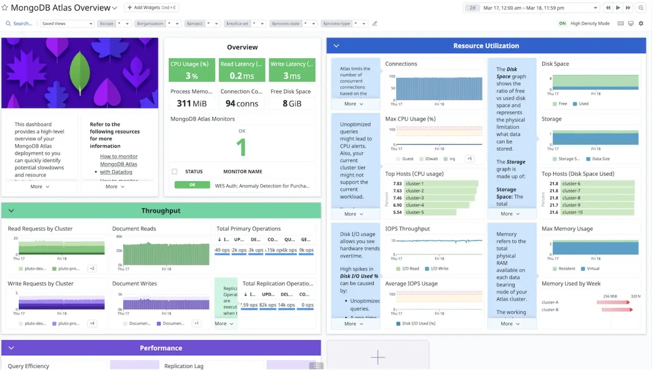
Image Source: MongoDB
MongoDB Atlas emerges as a unique contender in the data visualization space, offering a document-based database platform with robust visualization capabilities built directly into its ecosystem.
MongoDB Atlas key features
MongoDB Atlas stands out with its fully-managed cloud database operating across AWS, Azure, and Google Cloud. The platform includes Atlas Charts—a native visualization tool that works directly with JSON data, eliminating the need for ETL processes or data duplication. Meanwhile, the Vector Search functionality introduced in 2025 enables semantic search and recommendation systems without managing separate vector databases. Another key advantage is the Data Lake feature, which allows querying data stored in multiple formats including JSON, BSON, CSV, and Parquet.
MongoDB Atlas pros and cons
Pros:
- Native document model support simplifying data visualization
- Seamless visualization within the MongoDB Atlas interface
- Free tier available for testing and small applications
- Multi-cloud deployment across major cloud providers
- Automatic scaling capabilities for handling variable workloads
Cons:
- Higher pricing compared to self-managed alternatives
- Learning curve for those unfamiliar with document databases
- Memory usage can be intensive
- Occasional performance and latency issues reported
- Cost structure complexity for large-scale deployments
MongoDB Atlas pricing
The platform operates on a pay-as-you-go model with several tiers. The free-forever M0 tier includes 512MB storage and up to 100 operations per second. Subsequently, dedicated clusters start at USD 0.08 per hour (approximately USD 57.00 monthly), while Serverless instances charge USD 0.10 per million reads.
11. SAP Crystal Reports
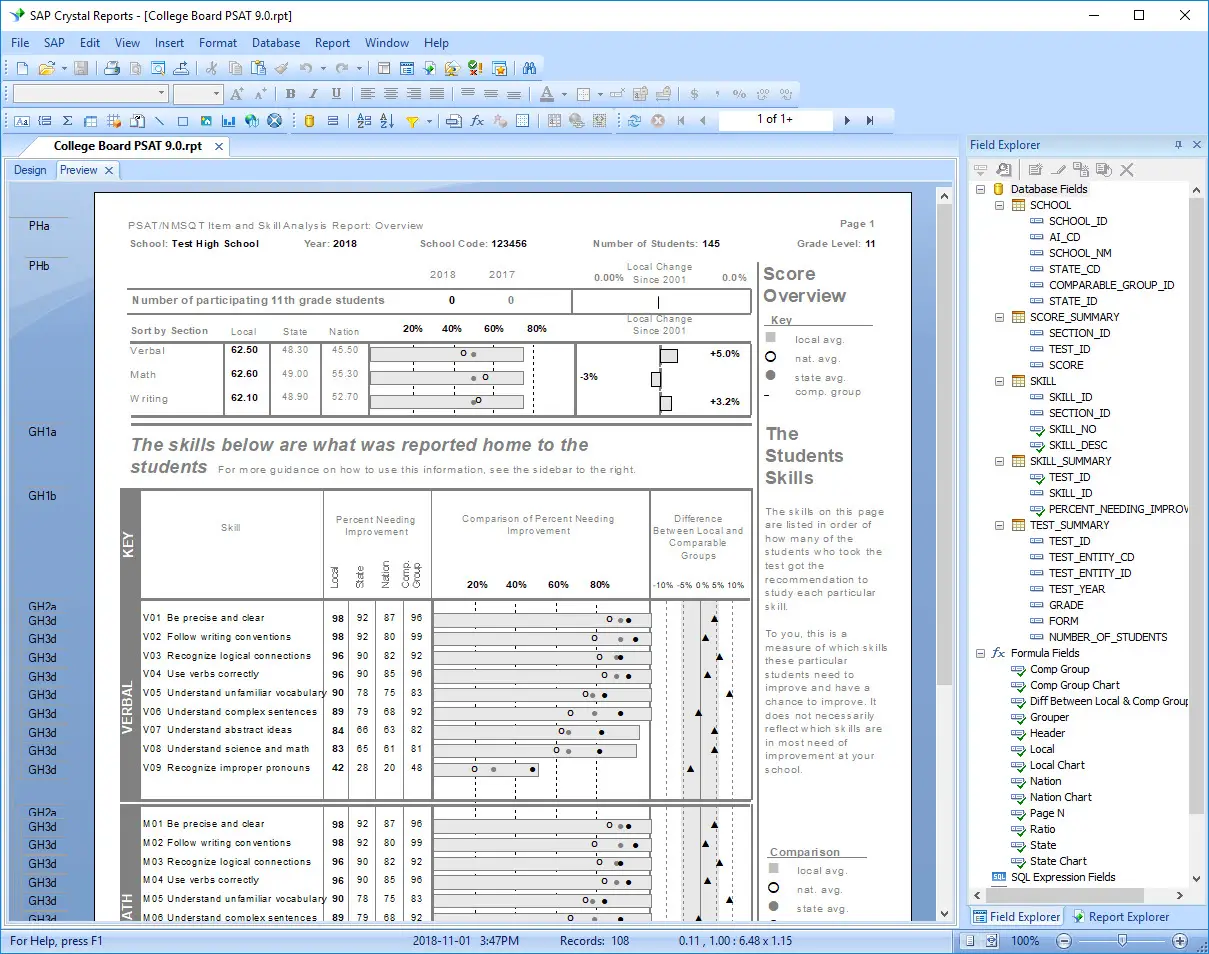
Image Source: Wikipedia
SAP Crystal Reports key features
SAP Crystal Reports excels at creating highly formatted documents with drag-and-drop simplicity. Users can embed dynamic images and barcodes, going beyond standard business reports. The software connects to nearly any data source including SAP HANA, Microsoft SQL Server, Oracle, MySQL, and PostgreSQL databases. Undoubtedly, its multilingual capabilities shine with a user interface available in up to 28 languages. The platform also offers mobile access to self-service business intelligence reports.
SAP Crystal Reports pros and cons
Pros:
- Complete control over report layout and design
- Extensive connectivity to various data sources
- Fixed pricing model without per-report costs
- Successfully used worldwide since 1991
- Personalization options for language and format
Cons:
- Steep learning curve requiring technical expertise
- Performance issues when using sub-reports
- Incompatibility between newer and older versions
- Can be expensive with perpetual licensing model
- API integration challenges with some tools
SAP Crystal Reports pricing
The full product SAP Crystal Reports costs USD 495.00 per user. Upgrades are available at USD 295.00 per user for those with older versions. SAP Crystal Server 2020 Named User License is priced at USD 869.00.
12. Zoho Analytics
Image Source: Zoho
Zoho Analytics emerges as a business intelligence platform tailored for organizations seeking powerful yet affordable data analysis capabilities without requiring extensive technical expertise.
Zoho Analytics key features
Zoho Analytics offers seamless integration with over 250+ data sources, allowing unified analysis across multiple platforms. The platform features AI-powered assistant Zia, which enables natural language querying for intuitive data exploration. Users benefit from its drag-and-drop interface that simplifies report creation, even for non-technical staff. Interestingly, the platform includes embedded analytics capabilities allowing businesses to white-label dashboards within their applications. The tool also provides robust data governance features with row-level security and user management.
Zoho Analytics pros and cons
Pros:
- Budget-friendly pricing structure making enterprise analytics accessible
- Intuitive interface requiring minimal technical knowledge
- Comprehensive mobile apps for iOS and Android
- Extensive integration ecosystem with 250+ connectors
- Strong collaboration features including commenting and sharing
Cons:
- Limited advanced visualization types compared to specialized tools
- Occasional performance issues with extremely large datasets
- Less extensive community support compared to market leaders
- Custom SQL queries not fully supported
- Visual customization somewhat restricted
Zoho Analytics pricing
Basic plan starts at $24/month for 2 users and 500,000 rows. Professional tier costs $48/month with 5 users and 1 million rows. Premium plan priced at $115/month includes 15 users and 5 million rows. Enterprise offerings begin at $455/month with 50 users and 100 million rows. All plans include white-labeling options.
13. Grafana
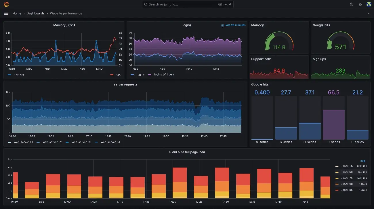
Image Source: Grafana
Grafana shines as an open-source platform for analyzing, monitoring, and visualizing telemetry data from diverse sources, making it a favorite among DevOps teams and system administrators.
Grafana key features
Grafana offers numerous visualization options including graphs, charts, tables, gages, heat maps, and geospatial maps. The platform integrates seamlessly with multiple data sources like Prometheus, InfluxDB, and various SQL databases. Remarkably, Grafana 12 introduced observability-as-code tools, including Git Sync for version control and Dynamic Dashboards with conditional rendering. The redesigned table visualization in Grafana 12.2 handles massive datasets with 97.8% better CPU performance.
Grafana pros and cons
Pros:
- Customizable dashboards tailored for specific monitoring needs
- Strong community support contributing plugins and add-ons
- Robust alerting system notifying teams via email, Slack, and PagerDuty
- Open-source nature significantly reducing costs
Cons:
- Steep learning curve requiring technical expertise
- Resource-intensive when loading complex dashboards
- Basic alerting capabilities compared to specialized tools
- Limited built-in remediation options
Grafana pricing
The free version includes 10,000 billable series and 50GB of logs, traces, and profiles. For premium features, Grafana Cloud offers tiered pricing based on usage, with visualization starting at $8.00 per active user monthly. Enterprise plugins cost $55.00 per active user monthly. Alternatively, Grafana Enterprise licenses are available with varying costs based on active users.
14. Visme
Image Source: Visme
Visme offers a versatile platform for visual content creation that bridges the gap between professional design tools and user-friendly interfaces. This Swiss knife of visual content transforms complex information into engaging graphics without requiring design expertise.
Visme key features
Visme’s AI Designer generates ready-to-use designs from text prompts in minutes. The platform excels in data visualization with options including charts, maps, and tables that can connect to live data sources. Users gain access to thousands of customizable templates spanning 50+ content types. The Brand Wizard automatically extracts colors, fonts, and logos from websites. Correspondingly, the platform offers real-time collaboration features allowing teams to comment directly on projects.
Visme pros and cons
Pros:
- Intuitive drag-and-drop interface accessible to non-designers
- Extensive library of templates, icons, and 3D graphics
- Robust data visualization capabilities with 50+ chart types
- Brand consistency tools for maintaining visual identity
- Interactive elements like hotspots and hover effects
Cons:
- Limited features in free version regarding storage and file uploads
- Performance issues reported even on high-spec computers
- AI prompts occasionally miss the mark
- Steeper learning curve for maximizing advanced features
- Multiple PDF downloads must be done individually
Visme pricing
The Basic plan is free with 100MB storage. The Starter/Personal plan costs USD 12.25/month (annual) or USD 29.00/month (monthly). For professionals, the Pro/Business plan runs USD 24.75/month (annual) or USD 59.00/month (monthly). Enterprise plans offer custom pricing with expanded features like Single Sign-On.
15. Domo
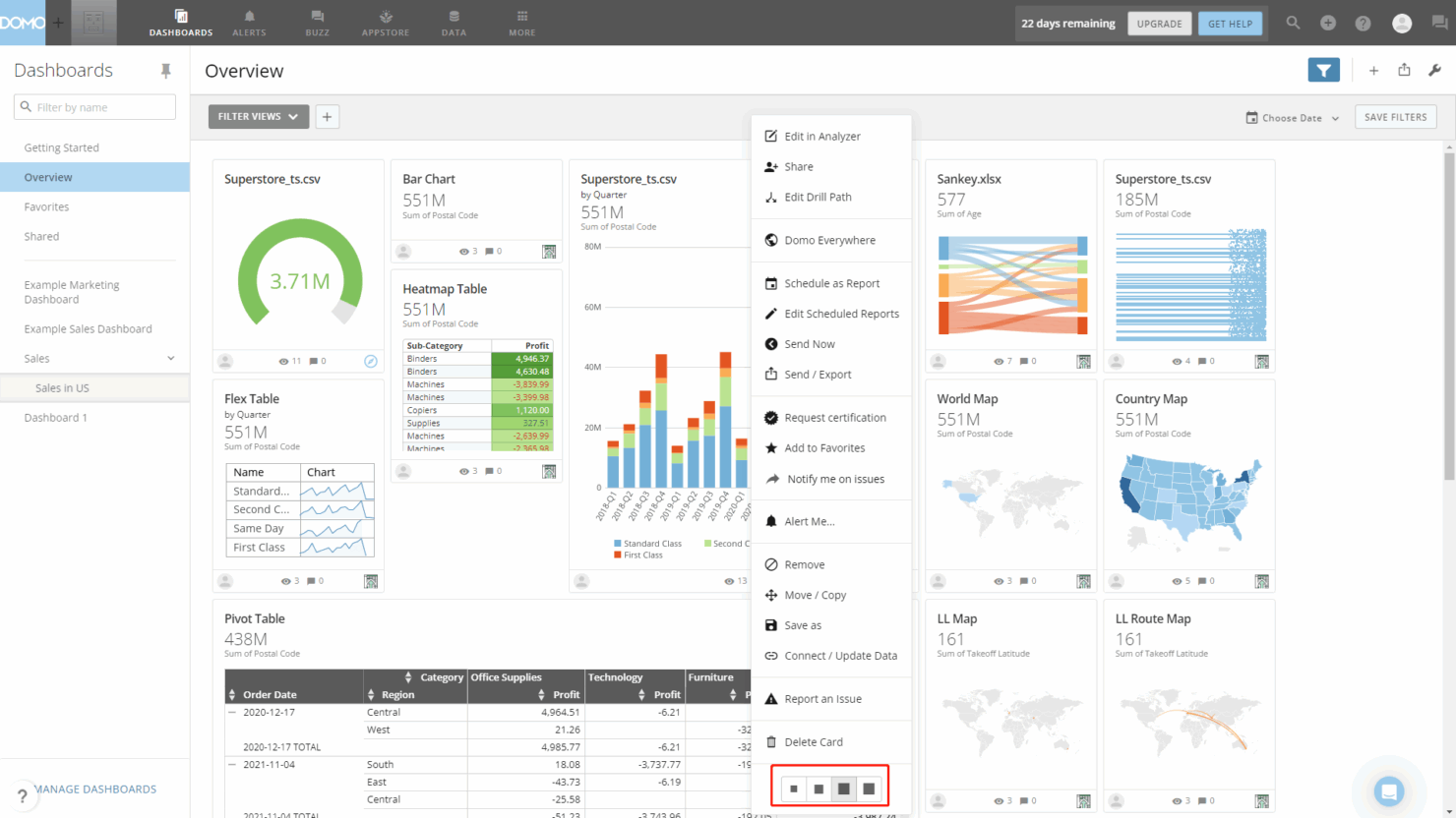
Image Source: The Digital Project Manager
Domo offers a comprehensive cloud-based business intelligence platform that connects, prepares, visualizes, and acts on data from multiple sources in one centralized location. This all-in-one solution transforms how organizations leverage data by combining ETL capabilities, visualization tools, and collaboration features into a unified platform.
Domo key features
Domo’s platform connects to 1,000+ data sources through pre-built connectors, eliminating complex integration challenges. The Magic ETL tool provides a visual interface for data transformation without requiring coding knowledge. Users can create custom apps and dashboards with drag-and-drop functionality while accessing real-time data updates. The platform includes Domo AI for natural language queries and automated insights. Additionally, Domo offers mobile-first design with full functionality accessible from smartphones and tablets, plus embedded analytics capabilities for white-label deployment.
Domo pros and cons
Pros:
- Centralized platform combining data integration, transformation, and visualization
- Extensive connector library with 1,000+ pre-built integrations
- Real-time data updates across all dashboards and reports
- Strong collaboration features including alerts, notifications, and social commenting
- Mobile accessibility with full-featured native apps
Cons:
- Premium pricing structure that can be expensive for smaller organizations
- Steeper learning curve compared to simpler visualization tools
- Some users report performance issues with very large datasets
- Limited customization options for advanced visualizations compared to specialized tools
- Customer support responsiveness varies according to user reports
Domo pricing
Domo operates on custom quote-based pricing tailored to organization size and needs. The platform typically starts around $750+ per user annually for standard plans. Enterprise pricing varies based on the number of users, data volume, and required features. Organizations should contact Domo directly for specific pricing, as costs can scale significantly with additional users and advanced capabilities.
FAQ
What is the best data visualization tool?
Tableau is the best all-around data visualization tool, offering exceptional visualization capabilities and 100+ data connectors that scale from small teams to large organizations. While the initial price is higher than competitors, Tableau’s comprehensive feature set at each pricing tier provides better long-term value since other platforms often require expensive upgrades to access advanced features.
What is the best data visualization tool for beginners?
Visme is the best data visualization tool for beginners, with its intuitive drag-and-drop interface that requires no coding or design skills. It includes an extensive template library for quick visualization creation. Looker Studio is another excellent free option for beginners, offering real-time data updates and easy integration with Google Analytics.
What is the best free data visualization tool?
Looker Studio is the best free data visualization tool. It’s a full-featured platform at no cost that provides real-time data updates, connects to 800+ data sources, and includes strong collaboration features. Apache Superset and Grafana also offer robust free open-source alternatives for organizations with technical expertise.
Which data visualization tool is best for small businesses?
Power BI is the best data visualization tool for small businesses, offering affordable pricing at $14/user/month with a user-friendly interface and seamless integration with Microsoft tools like Excel and Teams. For businesses with no budget, Looker Studio provides a completely free option with full-featured analytics capabilities.
What is the best data visualization tool for developers?
D3.js is the best data visualization tool for developers, offering complete customization control, enabling unique custom visualizations, and providing unmatched flexibility for developers comfortable with JavaScript. It’s completely free and open-source with no licensing costs.